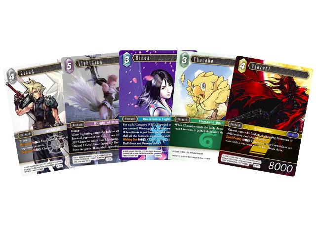
The FINAL FANTASY TRADING CARD GAME is a tabletop trading card game enjoyed by players all around the world, featuring characters and monsters from the FINAL FANTASY series. Some cards are decorated with familiar art, and others with FFTCG-original illustrations!
We’ll be showcasing these original illustrations along with artist interviews. Some of the art will even be available as wallpaper from the FF Portal App!
Interview with Toshitaka Matsuda, Plus Original Illustrations
We talked to Toshitaka Matsuda, an artist from SQEX who provided original illustrations of characters from FINAL FANTASY II and FINAL FANTASY V, and Mr. Matsuyama, a member of SQEX Merchandising overseeing FFTCG.
Toshitaka Matsuda
Past work includes FINAL FANTASY titles such as FINAL FANTASY IX, FINAL FANTASY X-2, and FINAL FANTASY XIII, and others such as KINGDOM HEARTS and Blood of Bahamut. Current art director for MOBIUS FINAL FANTASY.
―The producer of FFTCG, Mr. Kageyama, saw [Mr. Matsuda’s] illustration of Minwu in a collection of MOBIUS FINAL FANTASY art, and that’s how [Mr. Matsuda] ended up drawing the featured FFII characters. Mr. Matsuyama, as you’re in charge of handling the requests, can you tell us how it all began?
Matsuyama: It all started back when I was involved with creating merchandise. We were making MOBIUS FINAL FANTASY t-shirts, and that’s when I first laid eyes on Mr. Matsuda’s work. The design was based on MOBIUS FINAL FANTASY concept art, and the black and white style was reminiscent of American comic books.
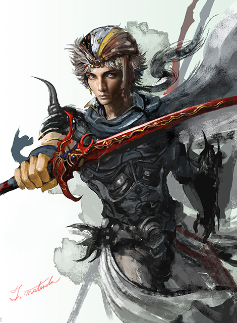
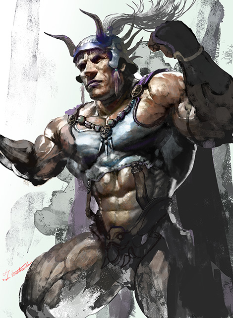
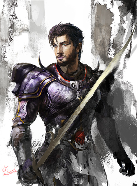
―Mr. Matsuda, this style is quite different from your work on MOBIUS FINAL FANTASY. How were these illustrations created?
Matsuda: First, I started with Leon.
Matsuyama: That’s right. The first pass was a dark piece with strong contrasts, similar to a Rembrandt. I told Mr. Matsuda that not everything needed to be drawn in detail, to focus on what was important. He then sent us several ideas, and we chose the one with the white background.
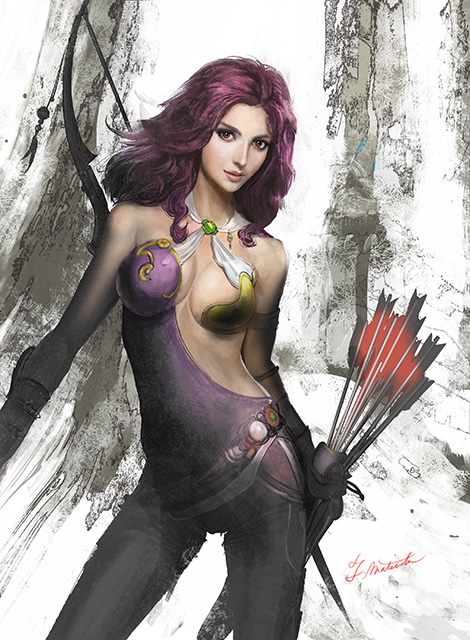
Matsuda: When I received the request, I was told to have fun with it, so I’d been trying different methods. I was playing around with the background, and when I had something close to the final design, I asked if that would work. When they liked it, I thought to myself, “So this kind of style works too.” I was also working on Maria at the time and had originally drawn some trees behind her, but I ultimately decided on a simple style like Leon’s. With a plain background, each FF character becomes the focus of the piece, especially their facial expressions, which captures their essence the most.
Matsuyama: My direction for this piece was that she be made to look as though she were in the spotlight. Personally, I love the red accent of the arrows.
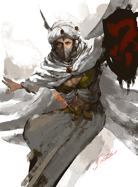
―Mr. Matsuda, you’ve drawn Minwu before, but was there anything you set out to do differently this time?
Matsuda: Well, I did everything I wanted to do with the first one for MOBIUS FINAL FANTASY. When I received the request for FFTCG, I decided to capture his humanity this time around. For MOBIUS FINAL FANTASY, I focused on creating a beautiful drawing, but for this, I wanted to convey his determination, passion, and loyal nature. The light shining on him also signifies his brief yet noble and selfless life. I was moved by this character and his story, and I wanted to make it feel as though he were alive. It took about a day to finish this illustration.
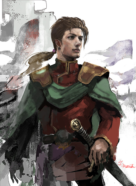
―Did you research other characters as well?
Matsuda: Yes, and what I learned about Scott was that he was a king among kings, a noble man who sacrificed himself for his beliefs. There actually weren’t many references, not even illustrations by Mr. Amano. I decided to depict him not as a side character, but a protagonist, a royal leader looking off into the distance―or the future.
―It really does look like a royal portrait. Are there any illustrations you’re fond of, or ones you’ve struggled with?
Matsuda: I struggled with Leon the most, as there was a lot of trial and error until finally deciding on this particular style. Though it was worth it, and changing Maria’s style to match turned out amazingly well. Also, Mr. Matsuyama’s fondness for the arrows’ red hue made me conscious of using more colors as accents.
―Can you share your process for the FFV characters featured in the latest Opus VII booster pack?
Matsuda: Since this was my second opportunity, I tried different forms of expression. Instead of getting rid of background detail altogether, I used blurring. I wanted to create harmony between the colors’ rough edges and shapes. The general direction had been set when I’d worked on the art for the FFII characters, so I adhered to that while making adjustments here and there.
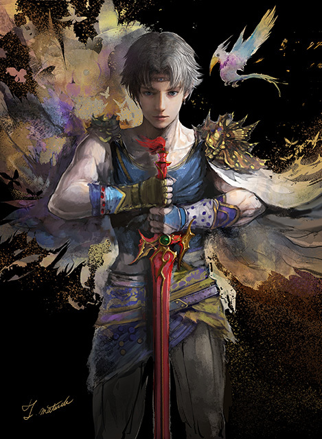
―Of all the FFV characters, Bartz has a different feel from the rest. When you received the request, you weren’t informed that it was a piece for the Opus VII package, but how did this end up with such a dark and differing style?
Matsuyama: Bartz was the first original illustration drawn for the Opus set package. For Opus VI, we weren’t planning on using the Firion illustration, but it was so incredible that we just decided to go with it. [laughs] Because of that, Mr. Kageyama requested that Bartz decorate the package of the Opus VII set. As for the process, I convey the image I’m looking for, and then we discuss where to go from there.
Matsuda: When I began drawing the character, I knew this was the pose. To adhere to FFII’s spirit, I had a white background contrasting Bartz’s strong, dark features. But then Mr. Matsuyama informed me that the color scheme of the Opus sets’ packaging alternates between black and white, and that this one should be black, but what I’d submitted was fine... [laughs] Hearing that, I couldn’t let go of the nagging feeling inside of me, and I didn’t want to mess with tradition, so I immediately changed the background color. Somehow, it fit perfectly; it was exactly what I’d envisioned. The art in the background was drawn to blend with the white, but the black allows for a powerful contrast and helps the background stand out, which almost mirrors Bartz’s strong will.
―I see. So this extraordinary work was created partly by chance.
Matsuyama: This depiction of Bartz is incredible, especially the detail of his left eye. The twinkle in his eye and the highlights were so astounding that we arranged the package design to make it pop. To do so, we needed a really deep black, so we decided on “rich black,” but it’s kind of an expensive color. [laughs] I was told that it would bump up the production cost, but I said it didn’t matter.
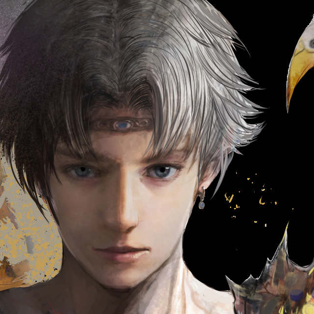
―Mr. Matsuda, did a lot of work go in to drawing his eye?
Matsuda: When the end is nowhere in sight, you put your all into what you can do at that moment. That’s what that eye represents. [laughs] During the process, as the picture starts to come together, the points that require more detail and time become clearer. For this illustration, it was his left eye.
―I sense a slight Japanese feel. Is that from the reference documents you were given?
Matsuda: To incorporate gold into the piece, I referenced makie [Japanese lacquer sprinkled with gold or silver powder], which is probably where the Japanese feel comes from. I find Japan’s intrinsic beauty quite wonderful, and I wanted to fuse that into this piece.
―Bartz has several costumes. Is there a reason you chose this one?
Matsuda: I simply started drawing him wearing this costume. As I looked more into this character, I realized he had more than one. [laughs] His hair was even brown at first, but I decided on this color instead to fit with the black background.
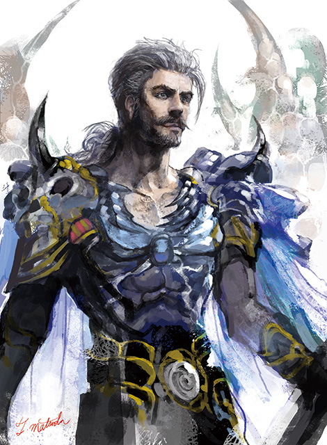
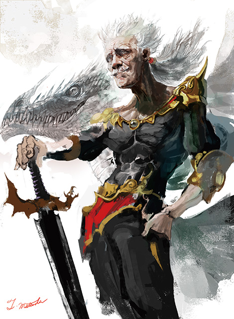
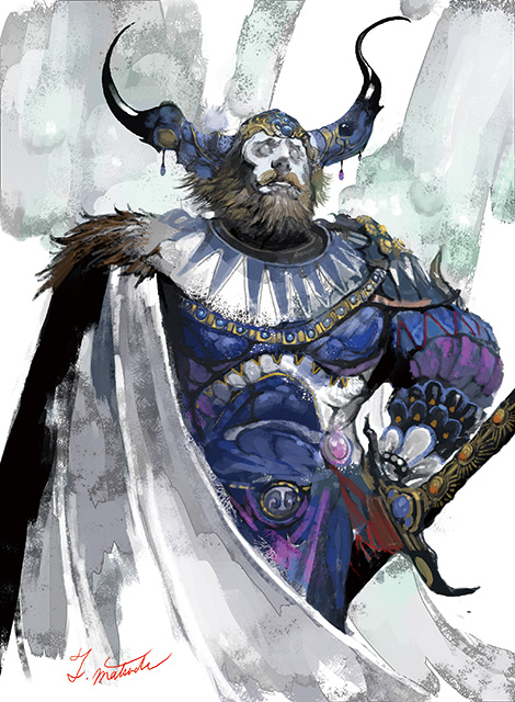
―For the FFV illustrations, Mr. Kageyama chose Bartz and the four Warriors of the Dawn as he believed their dramatic lives matched your dramatic artistic style.
Matsuda: As with the FFII illustrations, I researched the characters thoroughly and realized just how extraordinary they actually were. I had previously illustrated Xezat for MOBIUS FINAL FANTASY, so this was my second endeavor. I learned he was a fearless character, a gallant hero who single-handedly commands a fleet near his story’s end, and I worked on the illustration as if it were a portrait of a real hero.
Matsuyama: When I was asked how much detail should go in the piece, I responded, “less is more.”
―There’s something unique in the blurring and blending of the colors.
Matsuda: To spread the color, instead of using the “smudge” feature, I created and used actual colors. I did the same for the gradation rather than simply changing the colors’ brightness or saturation.
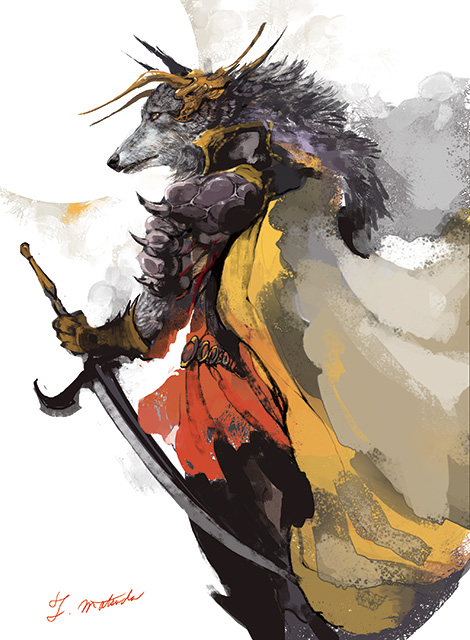
▲ This illustration of Kelger is Mr. Matsuda’s second favorite after that of Bartz. His cape illustrates a distinctive blending of colors.
―Were there any differences between these FFTCG illustration requests and your usual workflow?
Matsuda: First of all, with my usual tasks, there’s no long, enthusiastic back and forth during the process. For FFTCG, I was asked to express myself, and it was encouraging to know they wanted the work to reflect me and my own style. I was reminded that illustration was about joy and freedom, not just about drawing precisely and well. I feel this reminder has also been reflected in my work on MOBIUS FINAL FANTASY. Aspects that had become routine felt new again, and I was able to challenge myself in terms of expression; after a long journey, I’d returned to the basics.
Matsuyama: FFTCG is filled with art from the FF series, but when players open a pack containing original illustrations, I want them to think, “Jackpot!” That’s why I’d like the art style of the characters to differ from their respective titles, so they work as standalone pieces.
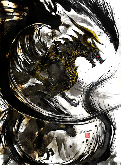
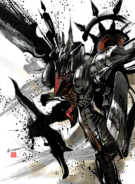
―Before we wrap up, can you tell us a little bit about the illustrations of the Opus VIII set coming out in March? The style is very different, and it looks spectacular!
Matsuyama: It is. [laughs] Mr. Matsuda’s first pass of Bahamut was actually of a very familiar-looking Bahamut. I asked if he could add more obvious brushstrokes, more intensity, more chaos as if the monster were thrashing around.
Matsuda: After receiving the feedback, I drew Bahamut with varying levels of movement, and they chose the most dynamic depiction. [laughs] I’d drawn a lot of comic book-style concept art in the early stages of MOBIUS FINAL FANTASY, and we talked about utilizing that style with more powerful brushstrokes.
―With the comic book feel of the black, the art is a nice fusion of eastern and western culture.
Matsuda: I definitely wanted the black to be bold. Comic books tend to balance black nicely with other colors, and I feel I was able to do the same.
―Which FF title would you like to illustrate in the future?
Matsuda: FINAL FANTASY VI because it’s my favorite. I played it when I had a lot of time to spare, and I was able to immerse myself in the game.
―I look forward to seeing your original FFVI illustrations in the future! Thank you both for your time!
The next interview will be with illustrator Ryoma Ito and will feature original art based on FINAL FANTASY TACTICS A2: Grimoire of the Rift. Don’t miss it!
Original Artwork Wallpaper: Firion
The Opus VI package illustration, Toshitaka Matsuda’s original artwork of Firion, has been made into a wallpaper!
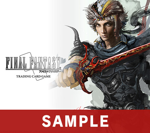
Item name: Wallpaper: Original Illustration "Firion"
Valid Until: 3.31.2019 (GMT)
Download the wallpaper on the FF PORTAL APP!
Download the FINAL FANTASY Portal App here!
What is FFTCG?
FFTCG is a one-on-one tactical card game featuring FINAL FANTASY characters and summons. Not only is there fun in collecting cards featuring familiar faces, the main draw of the game is the simplicity of the rules combined with the complexity of the gameplay. The art drawn for the game by famed illustrators is also a popular aspect of FFTCG!
Find the store nearest you carrying FFTCG using our store locator!
https://fftcg.square-enix-games.com/na/page/where-to-buy
Play the FFTCG tutorial:
https://fftcg.square-enix-games.com/na/page/tutorial
Read the interview with the FFTCG producer here!


