With Chocobo GP releasing, we were able to pull aside the game’s director, Mr. Maeda, and art director, Ms. Asami, for some questions and answers. In this installment, we inquired about the game’s design and details to watch out for.
―Would each of you please tell us about your duties on Chocobo GP?
Maeda: I served as the director for Chocobo GP. While overseeing development as a whole, I was also responsible for the story mode’s direction and production, as well as the story and dialogue itself.
Asami: I handled character design for Chocobo GP, and also supervised its design aspects among other duties as art director.
―Were there any points during production that you particularly focused on or gave special consideration?
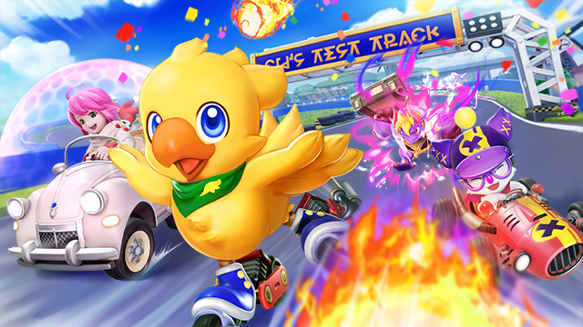
Maeda: It’s not something to compare directly per se, but I believe Chocobo Racing was made to be competitive with other games in its genre at the time, while leveraging the appeal of Chocobo and FINAL FANTASY [hereafter “FF”] and sporting unique controls, too. For Chocobo GP, we put particular importance on the feel of the game. We balanced it with a mind toward making it so even first-time players won’t feel that it’s hard to play or difficult to control. I think we got to a place where even people who don’t usually play racing games can easily get used to it and quickly grasp the controls. Our primary standard for evaluation was based on, “Is this easy to understand or not?”
―So someone who isn’t used to racing games should still be able to enjoy it and get a taste of the world of Chocobo and the FF series?
Maeda: Right. We were really conscious of whether this is a game that everyone can have fun with together.
―Can we assume that Chocobo GP has a good smattering of elements from the previous entries in the Chocobo and FF series?
Asami: Yes, we had help from a number of individuals with the overall design this time. Starting with Mr. Itahana, who gave birth to Chocobo as a character, and then Monster Octopus from the THEATRHYTHM series, Ms. Kawahara from the FF Portal Site, Ms. Fujise, who is thoroughly familiar with FF design, Ms. Ishii, who has worked on many FF titles; all these designers gathered together, and I think we could produce design work with a deep understanding of its source.
―Next we’d like to hear about the particulars that went into the design aspects of the courses, characters, and rides. Could you please tell us about the courses first?
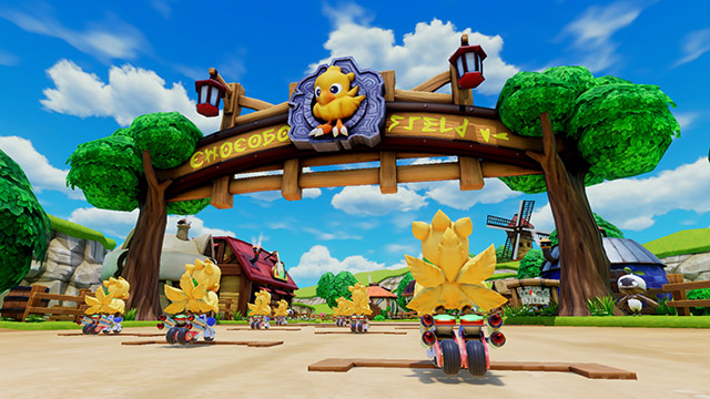
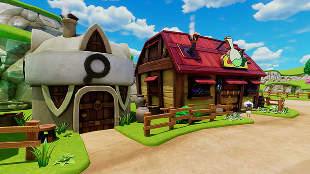
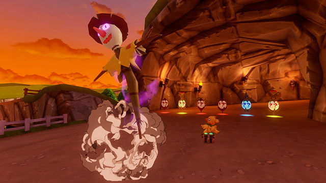
• Chocobo Farm (from Chocobo’s Dungeon)
Maeda: In Chocobo’s Dungeon, the farm grows larger as you progress through the story. We wanted to reflect that, and although the short course and hyperspeed course are both based on the same thing, they do have some differences.
Asami: The final scene of Chocobo’s Dungeon features a setting sun, and that’s the imagery we matched it with. It’s the farm close to the end of the game. We’ve decorated the course with things that I hope those who’ve played Chocobo’s Dungeon will notice; for example, the scarecrow is a must. [laughs] At first the crops in the field were regular vegetables, but we made those gysahl greens, and the course’s gate is based on Chocobo’s Dungeon’s package art. I hope this course stirs up feelings of nostalgia.
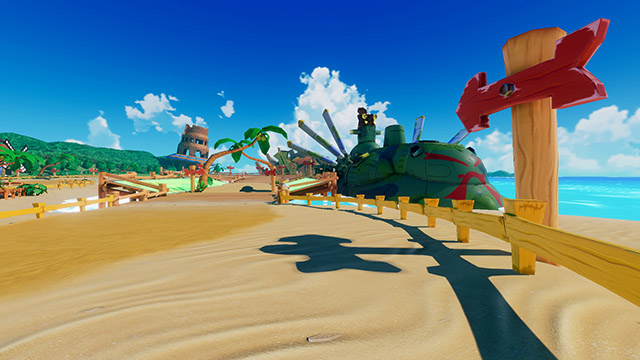
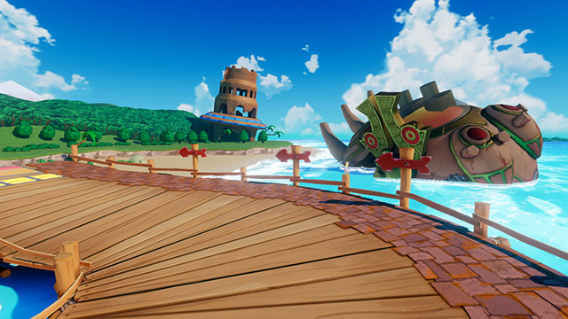
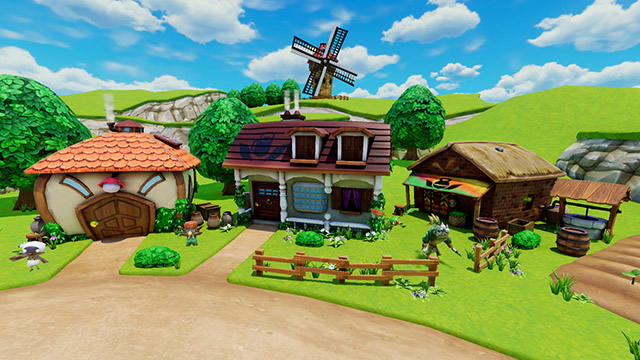
• Monster Village (from Chocobo’s Dungeon 2)
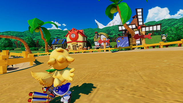
Asami: We faced a similar challenge with Chocobo Farm, but we had to think about what gives it the sense of being lived in by monsters. If the fences and houses around the village were made too neat, it might come across as too human or factory-made, and not very monstrous. To that end, things aren’t lined up nicely and we tried to bring out its crudeness.
Maeda: We purposefully gave it all an uneven feeling, something not too pretty. You might say the courses based on the Chocobo’s Dungeon series share an atmosphere in that sense.
Although we based the course on the village that acts as your home base in Chocobo’s Dungeon 2, rather than recreating the village as is, we repositioned the buildings, the surrounding forest, the bay—it’s a reconfiguration. Players who know the village should recognize it right away. It has a bit of a tropical feel, being a seaside course.
Asami: I wanted to make sure it made for a warm image, and therefore avoided using any dark colors. I was especially careful about the areas that would fall in shadow. If the shadows were too black, it would give it a gloomy feel, so we applied plenty of color to give it that clear, tropical atmosphere.
By the way, there’s a bit of FFX on the beach. It’s subtly mixed in, so please search it out.
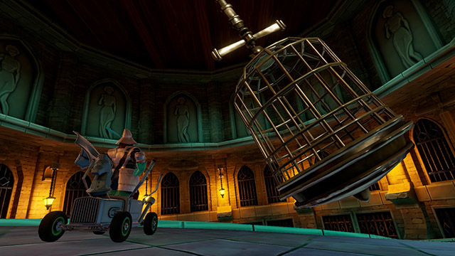
• Alexandria (from FINAL FANTASY IX)
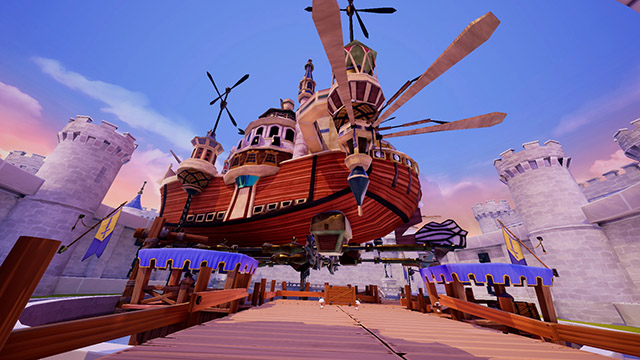
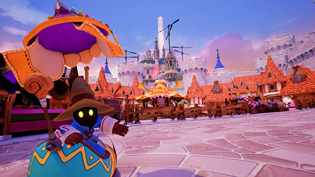
Maeda: Alexandria was a course we first made during the prototyping stage, and it was already in good shape from the start. The Prima Vista airship that appears in FFIX can be seen above the course, and I recall really trying to get its position just right so that you can get a good look at it because it’s so well made. [laughs]
We had to make a course you’re able to race on, so the layout differs from the Alexandria of FFIX, but we included recognizable elements so that anyone who sees it will know it’s Alexandria. There’s the ticket booth, for example, and the cage Steiner gets locked up in.
Asami: Alexandria is often remembered from the beginning of FFIX, so this became an evening course. I hope it feels like FFIX, even if just a little bit.
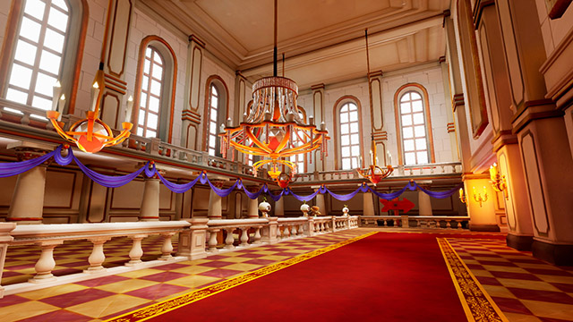
Maeda: As a long course, you’ll race inside the castle, which includes sections that weren’t visible in FFIX such as the castle roof, so we took care to design it in a way that matches the atmosphere.
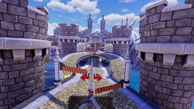
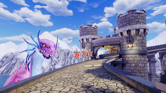
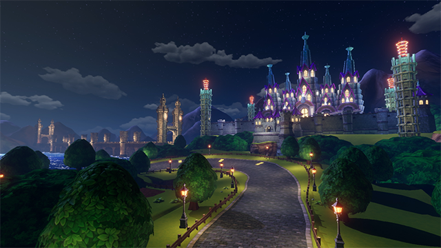
• Big Bridge (from FINAL FANTASY V)
Maeda: Anyone who’s played FFV probably knows this, but Big Bridge is just a straight bridge. Early is development, we did have talks like, “Could we get away with a drag race on a straight bridge?” [laughs] In the end, it became a course with a distinctive design and complicated shape. It felt a little lonely without anything in the background, so we included the airship and Syldra from FFV.
Asami: The original design was a normal bridge drawn in pixels, so taking that to 3D…and moreover making it a racecourse was really something I stewed over. How do I make the users believe this is the Big Bridge? Something too over the top wouldn’t match the original design, so the bridge itself should be simple. I thought about drawing out the FFV atmosphere with the airship, Syldra, and the sea in the surroundings.
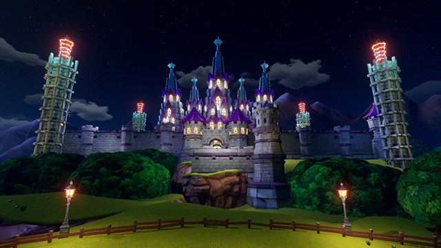
Maeda: There are a several courses for Big Bridge as well, including a tutorial course in the story’s prologue, but just like the location in FFV, you can see Exdeath’s castle from Big Bridge. It has a distinct silhouette and the barrier towers surrounding it; it’s a course that brings out the setting of FFV as much as possible. I was quite happy with the response we got when we revealed it on Twitter. [laughs]
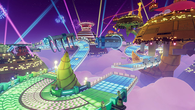
• Gold Saucer (from FINAL FANTASY VII)
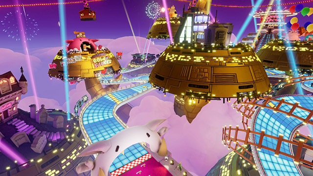
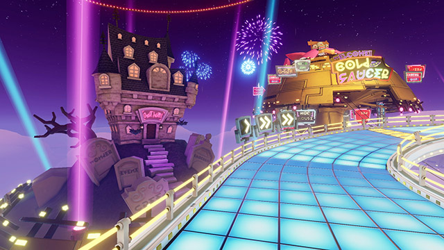
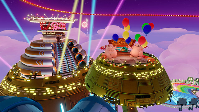
Maeda: I think this might have been the first time anyone has had to consciously connect each of the Gold Saucer’s areas in 3D. [laughs] While referencing materials from FFVII, we had to investigate details such as the position of each area in relation to each other and what exactly goes where. There are both long and short courses, and both are based on the long and short courses you would run in FFVII’s chocobo races.
In respect to the overall location, there’s the scene in FFVII where you ride the gondola, and we took our inspiration from the chocobo races you can see during that scene. Besides the gondola, you can also see the roller coaster; it’s made with quite a bit of detail.
Asami: We also talked about, “…And there in the gondola you can make out Barret’s silhouette!” [laughs] There’s so much that can go into the Gold Saucer, there was a question of whether it would be too difficult to recreate. Like, can we really get everything in there? We were envisioning an indoor roller coaster, and there was a suggestion of making it like racing in a miniature theme park, but we had some big FFVII fans and from the early stages of development the course was loaded with lots intricate details. It would have been such a waste, so we scaled it up.
Maeda: Not to let any of it go to waste, we also used the square in the story mode, too, so please look forward to that.
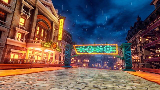
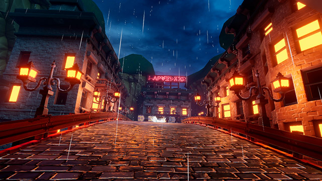
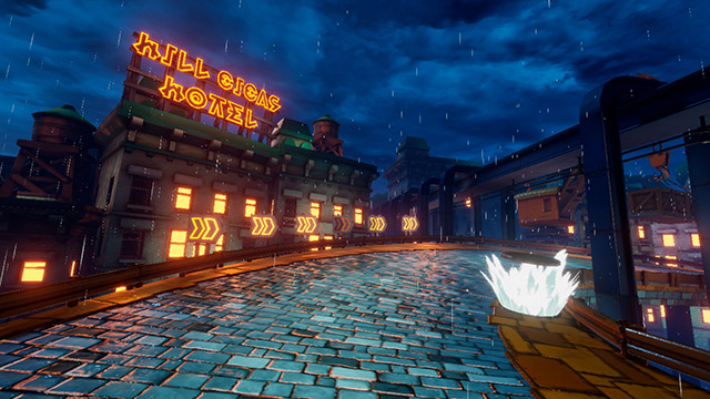
• Zozo (from FINAL FANTASY VI)
Maeda: There weren’t many original materials we could reference for Zozo, so we had to let our imaginations grow from the pixel art. We based the direction on American architectural styles from the ’50s and ’60s and that kind of retro feel. There are the shapes of the buildings and the neon atmosphere, and these weren’t in the original, but the cranes and monorail help create that retro-future feeling. Looking at the finished product, I think we arrived at something that players will say feels like Zozo.
Asami: This was a tough one. The Zozo in FFVI is dark as a whole, and not quite abandoned, but kind of a slum. It wouldn’t stand out as a course, and if we tried to replicate it as is, it probably wouldn’t be clear that it’s Zozo. So that’s why we took the wet streets, made the blurry lights look pretty, and really played up Zozo’s most impressive feature, the rain.
We included in our design suppositions like, even though the original Zozo didn’t really have any lights, maybe in its past it was a livelier town like this. While retaining the image of FFVI’s Zozo, we added original touches of a Zozo that exists within the world of Chocobo GP. There are a lot of playful aspects, like “Dadaluma” written in neon, and all of the signs having something to do with FFVI.
• Cid's Test Track (from Chocobo Racing)
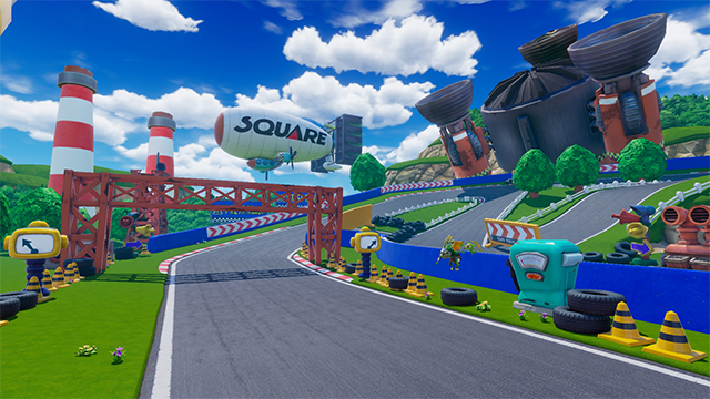
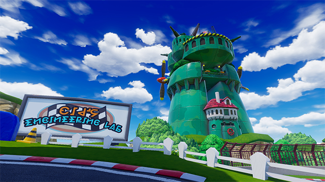
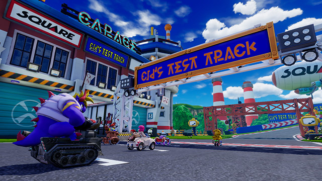
Maeda: This course includes elements from Chocobo Racing, such as the rocket stuck in the course name and in the background, and the blimp, but it has a new layout and new buildings, including Cid’s Tower from Chocobo’s Dungeon 2, to make a new course for Chocobo GP. Despite the new layout, the design should still make anyone who sees it feel this is Cid’s Test Track. In an homage to Chocobo Racing, the blimp has the “SQUARE” logo from back then, a point we were particular about.
Asami: This was the first course we completed with lighting and everything, so it was our baseline when preparing the design for everything else. Thus, it also became the background in the package art this time.
This course was also where we set the standard for “squishiness.” In this game, we really squished the backgrounds in order to match the squished style of the characters. We minimized straight lines and built the shapes with curves in mind, and balanced the details with things getting bigger as they go higher up, creating almost an optical illusion as regards the scale.
You might not notice it while racing, but the buildings on the side of the course are really much larger than the characters you’re controlling. We had to strike that balance to make sure the presence of the motifs could still stand out while you’re in the heat of a race.
―Could you next please tell us about the design of the characters and the rides?
• Chocobo
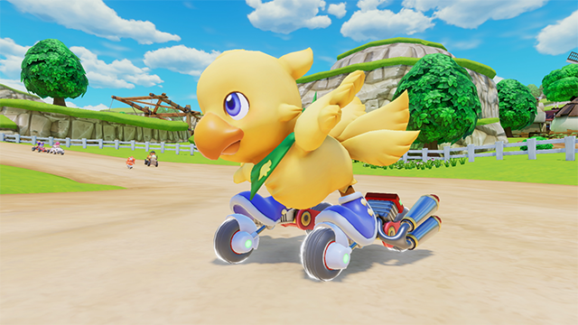
Maeda: Since Chocobo Racing, Chocobo has sported a pair of motor-powered roller skates, so we’ve stuck to that. I can’t imagine him in a vehicle. [laughs]
Asami: Depending on the title, Chocobo’s design will change to have a pouch around his neck, or a different color bag, but this time we gave him a scarf so you’ll know it’s Chocobo GP’s Chocobo.
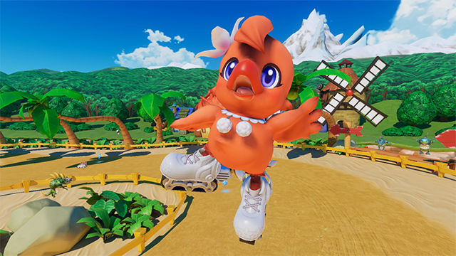
• Camilla
Maeda: Together with Chocobo, roller skates are also part of her image. Hers are closer to inline skates; compared to Chocobo’s, which are separated into front and rear wheels, hers form a single line. Her movements are like that of a figure skater.
Asami: I wanted to make her girly and cute, with shoes that look like something a beginner could race in without tripping and falling. [laughs] Like we did for Chocobo, she has girly ruffles around her neck for a bit of fashion.
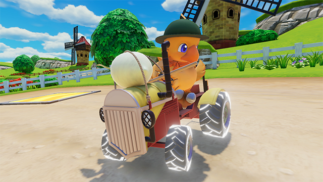
• Camilla’s Pa
Asami: I think we managed to give Camilla’s Pa a “Pa” look with his clothes and everything else. Chocobo’s hands are essentially his wings, so we don’t usually have him holding anything, but Camilla’s Pa works in the fields, so he’s a somewhat dexterous chocobo who can hold stuff. [laughs]
Maeda: Camilla’s Pa’s image is that of a farmer, so I absolutely wanted to put him on a tractor. [laughs]
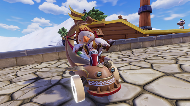
• Clair
Asami: A fat chocobo isn’t a fat chocobo if it isn’t sitting relaxed and comfortably, so we had to think of a design that would preserve that posture. The result was to put him in a hammock. As for the design of Clair himself, he’s wearing robes, but we gave it a bit of an Asian flavor to differentiate it from Shirma’s robes.
Maeda: Thinking on it now, sitting in a hammock and all is an amazingly free-wheeling design for Clair’s ride.
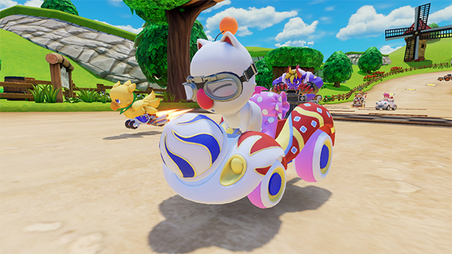
• Atla
Asami: The design of Atla’s ride is courtesy of Mr. Itahana [Toshiyuki Itahana, character designer of Chocobo in Chocobo’s Dungeon among other characters]. It has an FF-ness to it, and is colorful and novel.
When we were still feeling out the direction for the rides at the beginning of development, we had a lot of wild designs, things with pillows and stuff, but with this, the design of the rides really opened up from that point on.
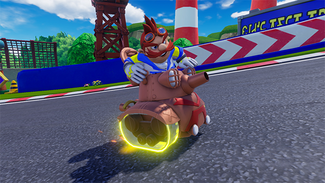
• Cid
Maeda: The motif for Cid's Tank comes from the tank he uses in Chocobo’s Dungeon 2. It’s a variation based on that.
Cid himself is based on the design from Chocobo Racing, and we decided early on that he’d be riding Cid’s Tank.
Asami: For characters who already had their own vehicles and backgrounds, we could basically proceed with the design from that existing image.
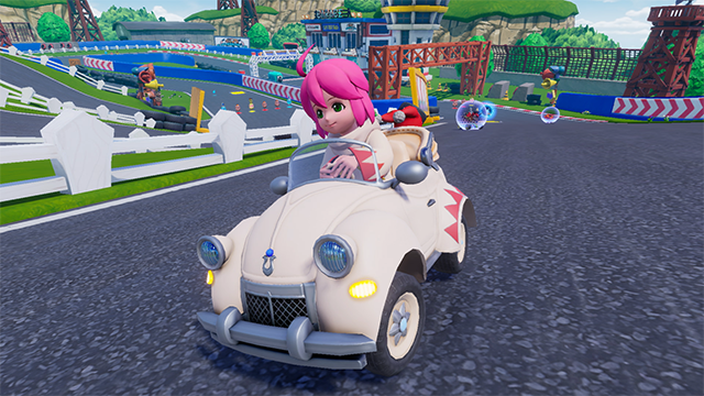
• Shirma
Asami: In Chocobo Racing she rode on a carpet, but in the story for Chocobo GP, there’s a rule that you need to have wheels to enter the race, and that’s how she ended up in a car this time. [laughs]
It’s designed with the theme of a stylish car. I’m not actually that familiar with car designs, though, so Mr. Maeda helped me out on that front.
Kurukuru makes an appearance, too, so please be watching for that! The appearance has changed a bit for variation, but it’s the same Kurukuru inside.
Maeda: We prepared lots of car materials to reference for the design, but we had some trouble when it came to layering reality and fantasy, usability within a game, et cetera. Like when crashing and the underside of the car can be seen, making sure there’s nothing strange in terms of how it’s constructed for example.
I feel I learned a lot during development about how cars are built. [laughs]
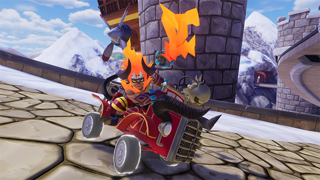
• Ifrit
Asami: Speaking of studying cars, Ifrit was born from a visit to the [Tokyo Fire Department] museum in Yotsuya. [laughs] The design took a lot of thought. As a summon, he should be larger and grander than regular monsters, and it’s difficult to think of him working at some profession. Whatever the setting, a summon needs to have an essence of cool to it. Ifrit’s a character striving for heroic coolness.
Maeda: Having Ifrit being a firefighter was something I’ve wanted to do. The fire coming from his hose has a will of its own and interacts with Ifrit, and I thought that relationship was where it becomes fun.
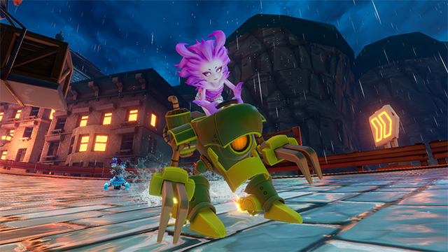
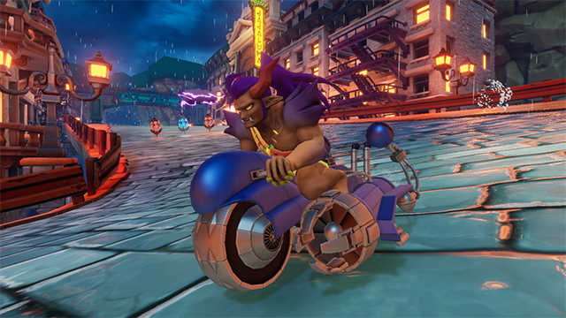
• Terra, Maduin
Asami: The Chocobo series doesn’t have too many human-shaped characters, and coming from Zozo and Alexandria being course candidates, we decided to have Terra and Vivi show up.
When it was decided we’d include Terra, we also decided to include Maduin, to whom she is deeply connected. The world of Chocobo GP allows us to paint an affectionate familial portrait of them.
In FFVI, Zozo is where Terra’s Trance form is featured, so we had her appear in Trance.
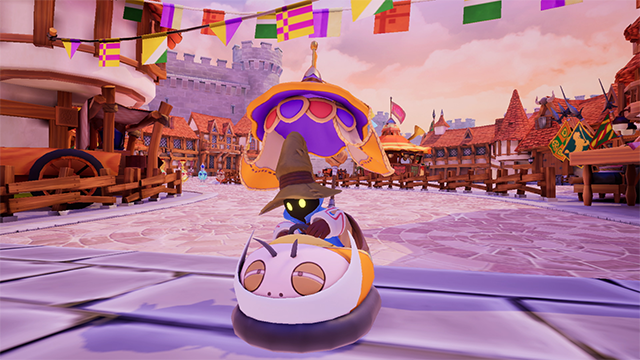
• Vivi
Maeda: Vivi’s ride is based on a bumper car you’d find in an amusement park. You could say I’m quite satisfied with his ride; that is, it turned out exactly how we designed it. Its movements are comical and fun.
Asami: We gave Vivi a car he could have fun riding in. I thought an amusement park ride would fit nicely. Since the ride would hide his trademark pointy hat, we gave the ride itself a pointy-hat silhouette.
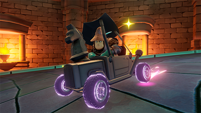
• Steiner
Asami: I never imagined Steiner riding in a car. [laughs]
Since Steiner already has a tin soldier image to him, we gave him a car like a tin toy. Same as Vivi, he’s a character with a distinctive shape to his head, so we put that essence into his ride, and I think it became a design where you can recognize it’s Steiner even at a distance. The ride also has an Excalibur II motif in it. A symbol of speed. [laughs]
Maeda: When I looked at the tin feel to Steiner’s armor, I thought that if we had to put him in a car, it'd be a vintage one.
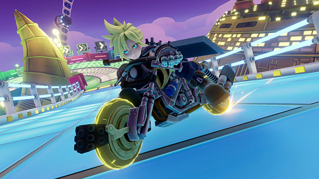
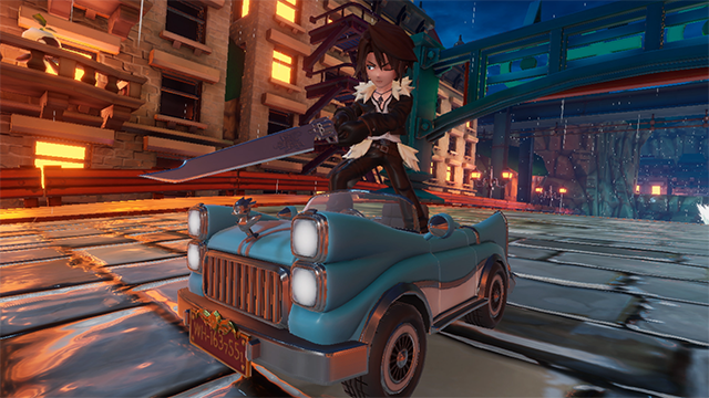
• Cloud, Squall
Maeda: Cloud rides the Hardy Daytona. But while the other characters’ ride variations are derived from their basic ride, only Cloud has different motorbikes.
Asami: Cloud’s bike is based on FFVII and was made in incredible detail. You wouldn’t be able to tell the difference between his bikes if we squished them too much.
Maeda: Squall rides the same car he used in the sorceress’s parade in FFVIII. He also used it in Chocobo Racing. When we decided Squall would appear, we also decided [his ride] without hesitation.
It wouldn’t have been very interesting as just a normal car, though, so we included a bit of characteristic movement to it. There’s a style of custom automobile in America called a lowrider, and his car can hop just like those.
The emblem on the front of the car changes with each variation; I hope you’ll pay attention to it.
Asami: It doesn’t hop while racing, of course, but it does when slipping or spinning out. [laughs]
Ms. [Mihoko] Ishii, a veteran designer on the FF and KINGDOM HEARTS series, was in charge of his ride’s design, and she had such a rich understanding of the original design and was able to recreate it quite nicely, I think.
―Do you have any rides you will recommend to everyone about to play the game?
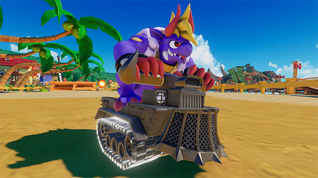
Maeda: They all have their own distinctive traits, so it’s hard to say which is best, but for example, take a slower car like Ben’s, which has tank treads for wheels: one of its merits is that it doesn’t lose speed when you go off the course.
Other rides all have their traits, too, so I think it’s best to play until you find what suits your style. Please give a bunch a try.
―Is there a particular way you hope people will play?
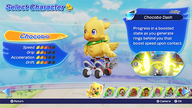
Maeda: I think a good way to play is to start with story mode, collect the different characters and rides, and then use them in Chocobo GP mode. Story mode is also enjoyable on its own, not simply a way to collect characters.
If you’re enjoying story mode and acquiring more characters, then I think you’ll have fun racing in the online Chocobo GP mode, and I hope that when you see rides you don’t have yet and become interested in how to get them, your fun will expand from there.
Asami: A lot of characters appear this time, and we included a lot of design motifs from throughout the series, so I’d love it if you’re able to spot a lot of them. But what I hope you’ll see most of all are all the characters having a good time racing. It would make me so happy if that’s able to make all the players have fun with the game.
―Please share your closing remarks with everyone looking forward to playing Chocobo GP.
Maeda: Although it is a racing game, I’d like you to enjoy it as a party game that everyone can pick up and play. You can play Chocobo GP mode in the Chocobo GP Lite version, and if you have the full version, up to eight people can play together over local wireless communication—you can play with others, so please pick it up and give it a spin!
―Thank you for your time!
Chocobo GP Wallpapers
Chocobo GP character wallpapers are available in the Item Exchange now!
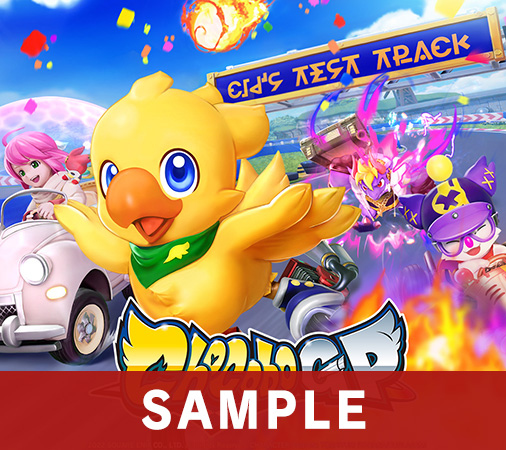
Wallpaper: Main Visual
Valid Until: Unlimited (until offer expires)
Wallpaper: Footprints
Valid Until: Unlimited (until offer expires)
Wallpaper: Soundtrack Cover
Valid Until: Unlimited (until offer expires)
Download the wallpapers on the FF Portal App!
Download the FINAL FANTASY Portal App here!
Chocobo GP

Chocobo GP is available now for Nintendo Switch on the Nintendo eShop!
Chocobo GP'
Chocobo GP’ is also now available on iOS and Android devices!
Download the app from the links below.


